
People trust an AI feature when they can see what it did, correct it easily, and understand what happens when it’s wrong. Design for the task instead of the chat box, show the result where the work happens, and treat waiting, errors and low confidence as main screens, not edge cases.
Our take: Most products don’t need another chat box. The best AI feature often looks like the product doing the boring part for you.
TL;DR
Start
Find the step in the task AI can remove, instead of adding a chat box.
Show
Make what the AI did visible, and easy to check.
Control
Let people edit, undo or reject every result.
Plan
Design for waiting, low confidence and wrong answers.
Start from the task, not the chat box
Ask what people are trying to finish, then look for where AI can remove a step. A chat box puts the work back on the user, because they have to know what to ask.
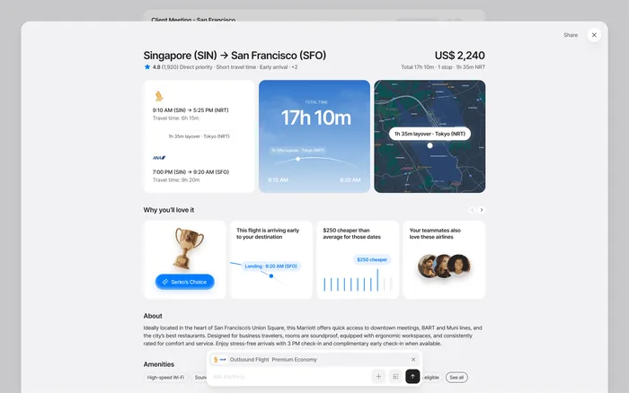
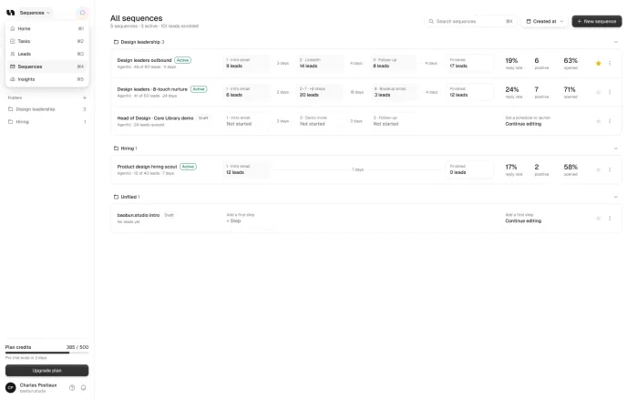
It’s often better to run the AI where the task already happens, such as sorting files as they arrive, or suggesting the next field in a form.
A chat box added on
- People must know what to ask
- The work moves to the user
- Hard to know what it can do
AI in the task
- Runs where the work happens
- Removes a step
- The result is easy to check
Show what it did
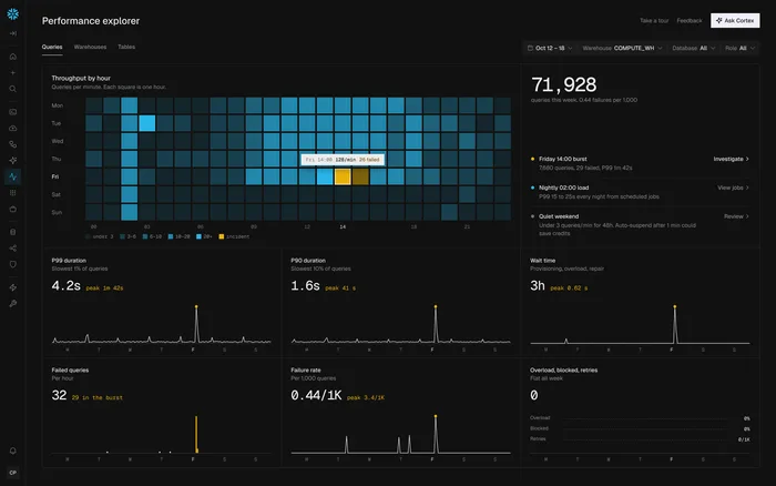
People trust what they can check. Show what the AI did and what it based that on, and make every result easy to edit, undo or reject.
Ask before anything that can’t be undone. And don’t add a sparkle icon to every button: when everything looks like AI, nothing tells people what’s actually happening.
Design for wrong answers and waiting
A wrong answer is a normal state in an AI product, so design it like one. Say when the AI isn’t sure, in plain words, and make correcting it a single step.
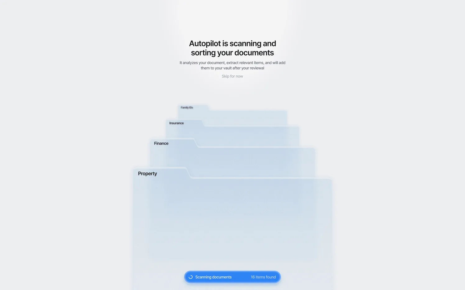
The same goes for waiting. Tell people what’s happening, instead of leaving them with a spinner.
Working
Say what it’s doing.
Not sure
Say so, in plain words.
Wrong
Make correcting it one step.
Done
Show the result, and what it’s based on.
Test with real responses
AI features can’t be judged from static screens. The answers change, so the design has to hold up when they’re long, short, slow or wrong. Demos built on perfect answers make real ones feel broken. That’s why we use coded prototypes for this work.
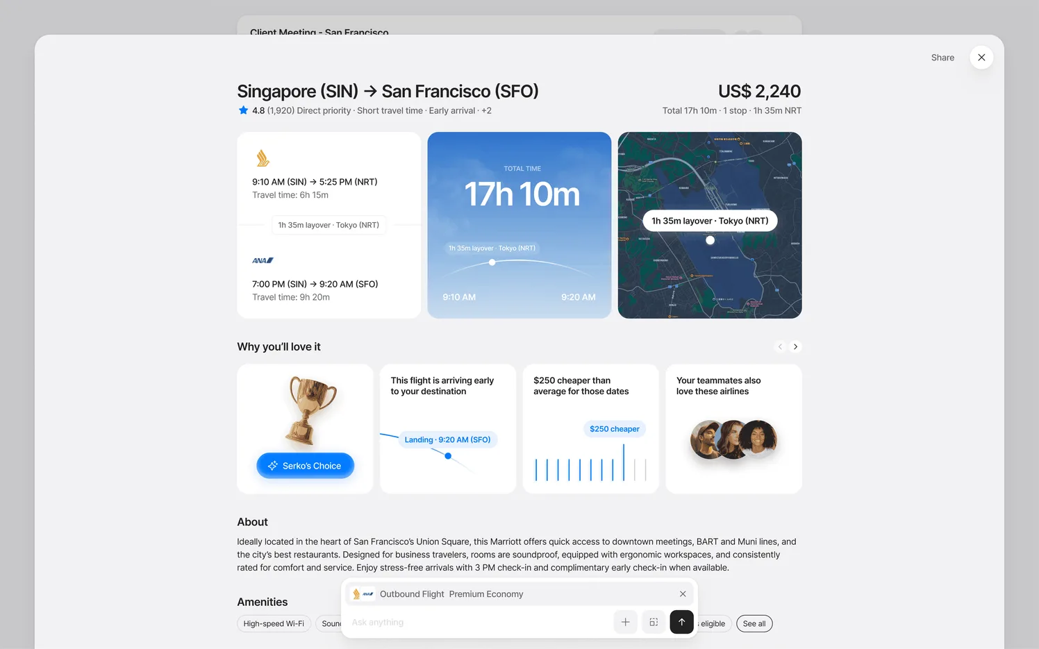
At Trustworthy, we made the AI sorting visible during the first upload, so people saw what the product did for them in their first minutes.
A check before you ship
Before an AI feature goes out, run through these four questions. They come up again and again, and Microsoft’s Guidelines for Human-AI Interaction are a good longer list to work from.
Is it clear what it can do?
People should know what to expect first.
Can they see why?
Show what the result was based on.
Can they fix it?
Correcting a result should take one step.
Does it ask first?
Above all before anything that can’t be undone.
How long can people wait?
AI is often slower than the rest of your product, so the wait is part of the design. Nielsen Norman Group’s long-standing limits still help: about one second before people’s flow of thought breaks, and about ten seconds before you lose their attention.
For anything longer, show progress, stream the result if you can, and let people get on with something else.
How to introduce an AI feature
The first use decides whether people try it again. An empty prompt asks them to guess what the feature can do, so show it working instead. Start with a real example from their own data, or offer two or three suggestions they can click.
Be honest about what it can’t do, too. A short line on its limits builds more trust than a promise that fails on the first try. And name it plainly: “Sort my files” tells people more than a branded assistant does.
Then watch what happens after the first use. If people try it once and stop, the first result probably wasn’t good enough, and that’s the thing to fix first.
Sources