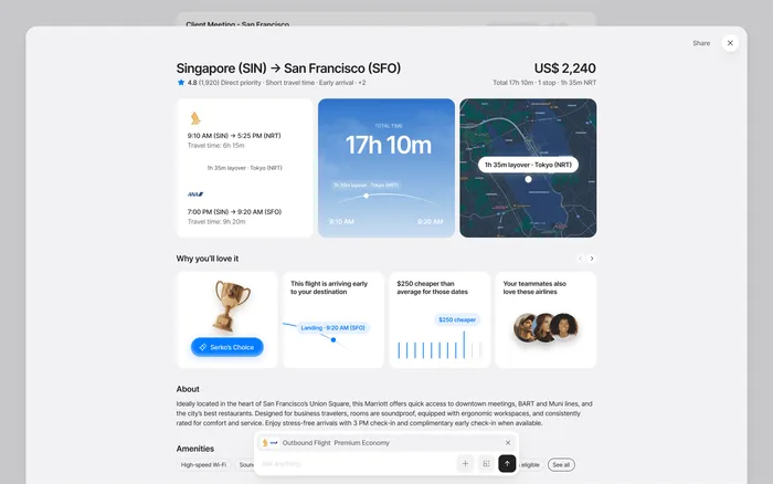
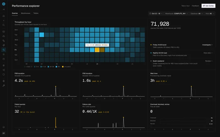
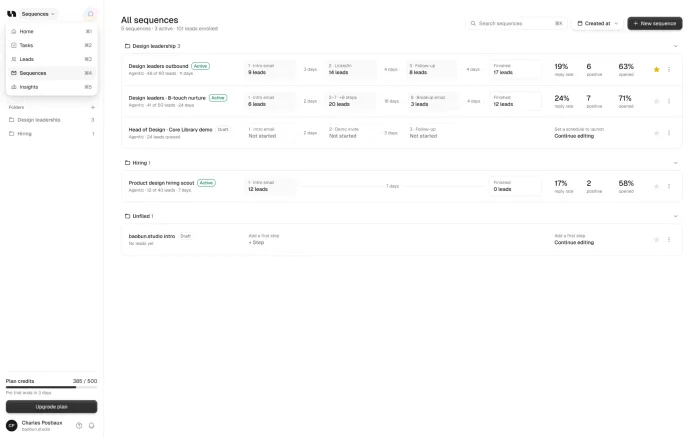

Good onboarding gets a new user to the first useful moment as fast as possible. Find that moment, cut every step before it that isn’t needed, make the first action feel easy, and only ask for an upgrade once people have seen the value. Most onboarding problems come from asking for too much before giving anything back.
Our take: Product tours rarely fix onboarding. If the first step feels like work, a tooltip pointing at it doesn’t change that.
TL;DR
The goal
Get new users to the first useful moment as fast as possible.
The cuts
Delay every question you don’t need yet.
The upgrade
Offer it after people have seen the value, not before.
The test
Try a coded prototype with new users before you build.
Find the first useful moment
Every product has a point where a new user gets what it does for them. Write that moment down in one sentence, then count the steps it takes to reach it.
Each of those steps needs a good reason to stay. Most onboarding problems come from asking for too much before giving anything back.
A storage app
Your first file, sorted for you.
An analytics tool
A first chart with your own data.
A team tool
A first teammate who joins.
Cut, then make the first step easy
Start by watching where new users stop, in your analytics and in real sessions. Then cut or delay every question you don’t need yet. A long setup form before the product does anything is the most common mistake.
Make the first action small, clear and safe to try, and show the result right away, where people can see it. If a screen is empty, give it a next step, not a blank page.
Offer the upgrade after the value
People won’t pay for something they don’t understand yet, so a paid plan pitched too early tends to get ignored. Wait until they’ve seen what the product does for them, then offer the upgrade at the moment it makes sense.
Too early
- Before the first useful moment
- People don’t know what it’s for
- Usually ignored
At the right time
- After people see the value
- Tied to what they’re doing
- Easy to understand
A real example: Trustworthy
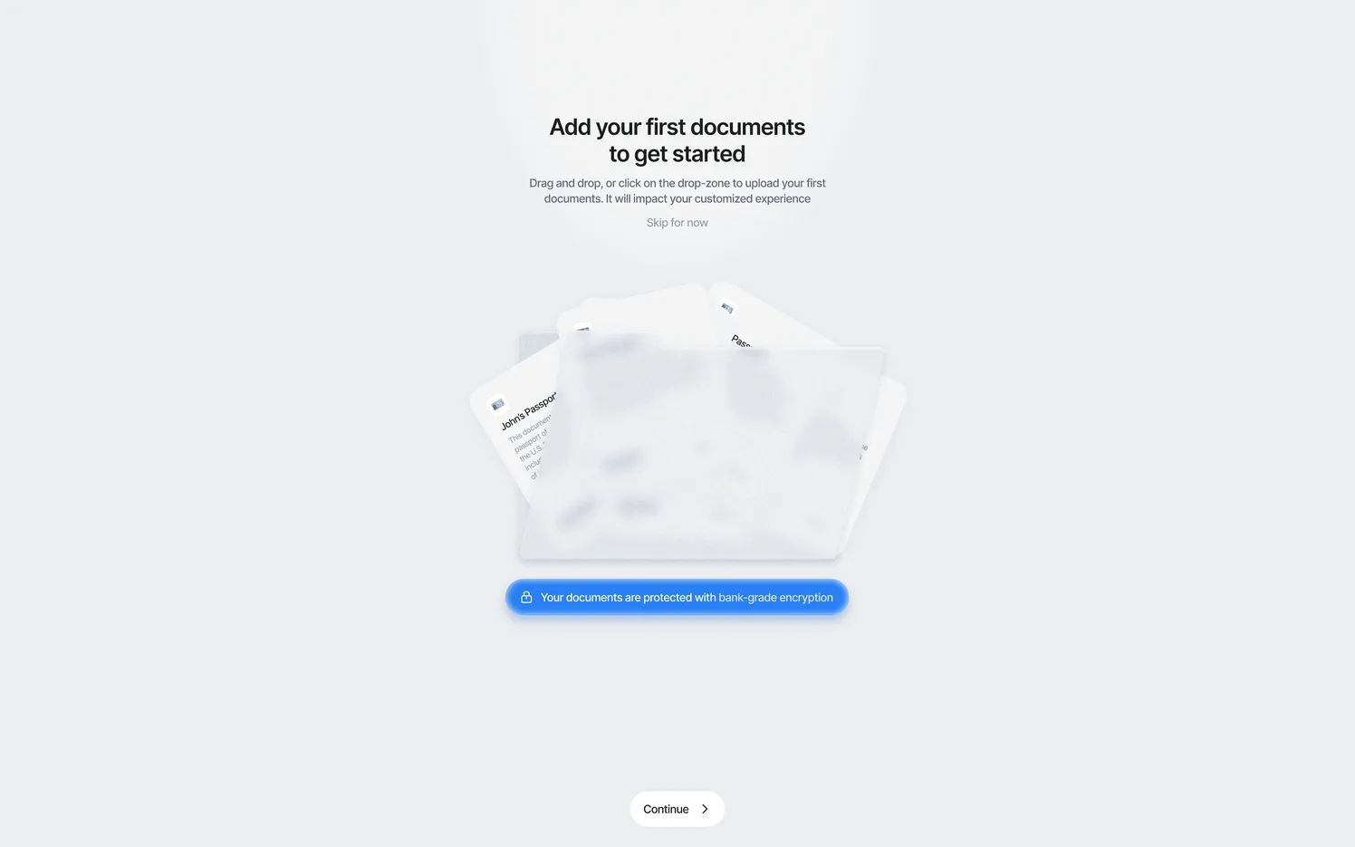
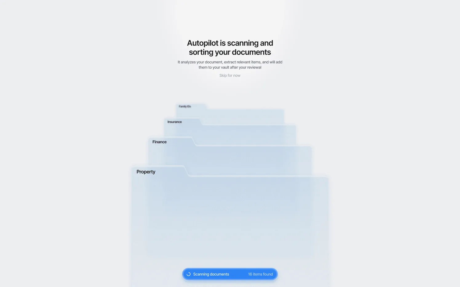
Trustworthy keeps a family’s most important documents safe and organized. The first upload felt like work and a risk, so many users never finished it, and they never saw the product sort their files.
We redesigned it around one clear first upload, with the AI sorting files where users could see it, and upgrade moments timed to when they matter. The value now shows up in the first minutes.
Test before you build
Onboarding is hard to judge from your own desk, because you already know how the product works. Put a coded prototype in front of new users before building, and watch where they hesitate.
What to measure
Sign-ups tell you very little about onboarding. Three numbers tell you much more, and you can usually get them from the analytics you already have.
Reached it
How many new users reach the first useful moment.
Time to get there
How long it takes them, in minutes or days.
Came back
How many return after their first session.
Empty screens matter more than you think
New accounts are empty by definition, so empty screens are many people’s first look at your product. Nielsen Norman Group points out that empty states are common during onboarding, and that a totally blank one leaves people unsure whether the system is working.
Use that space. Say what will appear there, and give people a direct way to do the next step.
Should onboarding be different for each user?
Often, yes, but less than you’d think. A short question at the start, such as what someone wants to do first, can send people down a better path. Only ask if the answer really changes what they see.
Keep it to one or two questions. Every extra one is another chance to lose someone before they’ve seen anything useful. If you sell to teams, also think about the second person who joins: they didn’t choose the product, and they often get no onboarding at all.
Invited users usually need a shorter path. Their account is already set up, so show them what their team has done and what’s waiting for them.
Person who signs up
- Chose the product
- Needs setup and a first win
- One or two questions at most
Person who is invited
- Didn’t choose the product
- Account is already set up
- Show them what’s waiting
Sources