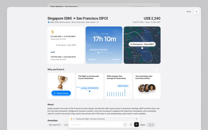
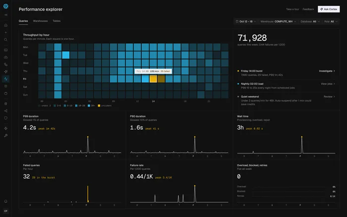
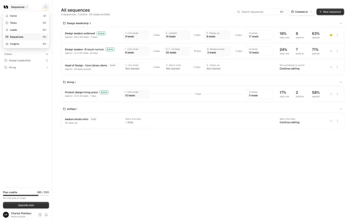

A SaaS startup needs a design system when screens stop matching, or when new features take longer to design than to build. That often comes earlier now, because AI tools produce UI fast and without rules. A small team doesn’t need a big library: start with tokens, the components you already use, and a few written rules.
Our take: Don’t build a design system as a project of its own. Build it from the real screens you’re shipping, or it won’t get used.
TL;DR
When
Once screens stop matching, or new features take longer to design than to build.
What
Tokens, the components you use, every state, and short written rules.
How
Build it from real screens and replace them as you touch them.
Where
In your code as well as in Figma, or the two drift apart.
The signs it’s time
You’ll usually notice it in small things first, then it starts to cost time. If three or more of these sound familiar, you’re past the point where a design system pays for itself.
Screens don’t match
The same button or table looks different across the product.
Small changes are big jobs
A tiny visual change means edits in dozens of places.
Design is the bottleneck
New features take longer to design than to build.
Five apps in one
Each team has built its part its own way.
What this looks like in a real product
This is what drift looks like. Nobody chose five kinds of Save button. They arrived one feature at a time, each one reasonable when it shipped.
Without a system
With a system
Every extra version costs a little: more code, more decisions, and a product that feels less trustworthy to the people using it.
What a small team really needs
Less than you think. You don’t need a documentation site or a huge library. Most startups can get a long way with four parts: tokens, components, states and a few written rules.
Color
Type
Spacing
Button states
Start with tokens, because everything else is built from them. Add the components you already use, each in one clean version. Then write the rules down, for your team and for AI tools like Cursor.
Style guide, component library or design system?
These terms get mixed up, and the difference matters when you’re deciding what to build.
How to start without stopping
You don’t need to pause your roadmap. Build it from the screens you already ship, in this order.
List what exists
Every color, button and table in the product.
Merge the near-duplicates
Six greys become two. Keep what works.
Put it in code
In your code as well as in Figma, or the two drift apart.
Replace as you go
Update screens when you touch them, not in one rebuild.
Why AI tools make this urgent
Tools like Cursor, Lovable and Bolt write UI quickly, and without rules they make new choices each time. That’s why an app built fast often ends up with five kinds of button. A short rules file gives them something to follow.
.cursor/rules/design.md
# Design rules
- Use tokens from tokens.css. Never a raw hex color.
- Buttons: use <Button>. Never style one by hand.
- Spacing: 4, 8, 16, 24, 32 only.
- Every list needs empty, loading and error states.Do you need a dedicated team?
Nielsen Norman Group warns that creating and maintaining a design system takes a lot of time and usually needs a dedicated team. That’s true for a large company. A startup can start much smaller.
What you can skip
- A documentation website
- A full-time system team
- Components nobody uses yet
- A big launch
What you can’t skip
- One clear owner
- Tokens in your code
- Your core components
- Rules your AI tools can read
How to keep it alive
Most design systems don’t fail at launch. They fade when people stop using them. The fix is to make the system the fastest way to build a screen.
One owner
Even if it’s only part of their job.
Add on second use
A component joins when two screens need it.
Review often
Every few weeks, move anything repeated into the system.
How we do it
There are two ways, depending on where you are.
With the monthly service, each change is a small pull request that you review. Nothing reaches your users without you.
Sources