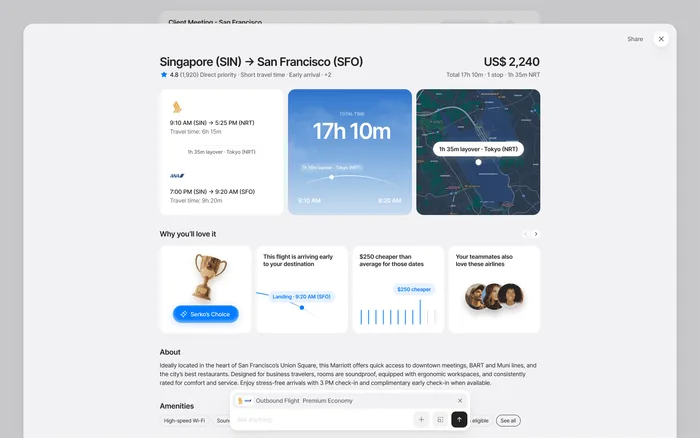
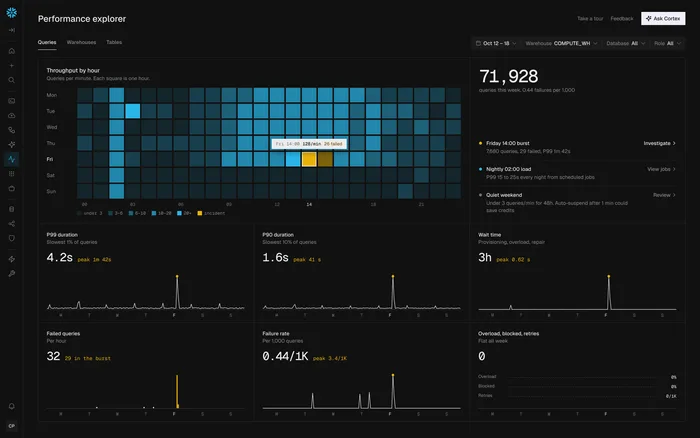
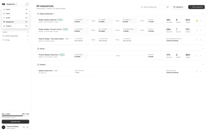

Three redesigns we led: Serko’s AI business travel booking, Booking.com adapted for corporate travel, and Trustworthy’s onboarding turned into an AI advisor. Each started from a clear problem, redesigned the flows that mattered most and tested them on a coded prototype.
Our take: The strongest redesigns in this list didn’t start with how the screens looked. They started with the one place people got stuck.
TL;DR
Serko
Booking rethought around AI, so travelers decide instead of compare.
Booking.com for Business
The familiar flow, with company policies and team trips built in.
Trustworthy
Onboarding around one clear first upload, with AI sorting people can see.
In common
An audit first, the core flows, a coded prototype and a design system.
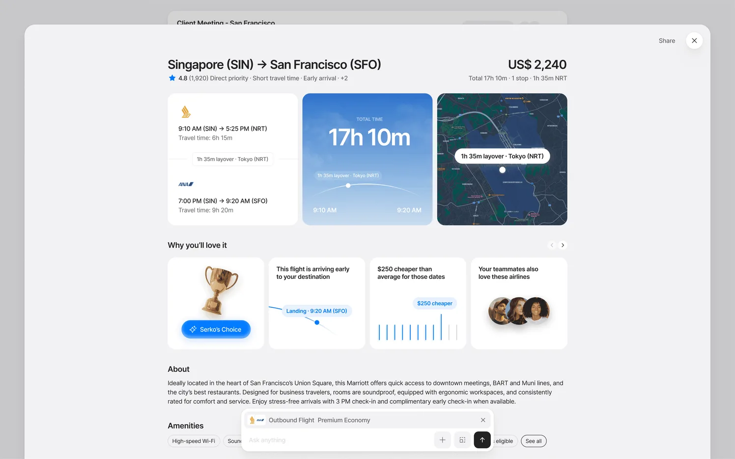
Serko: business travel, rethought around AI
Booking a work trip meant comparing, not deciding. Travelers worked across dozens of tabs and compared the same flights and hotels again and again, with company policy on top of all of it. Flights and hotels also worked differently, so people had to relearn each step.
We redesigned booking around curated recommendations and a conversational layer, with one set of patterns across flights and hotels. The hard part was the AI: it had to feel like an assistant, not a chatbot added to a form.
Booking.com for Business: a known brand, adapted for companies
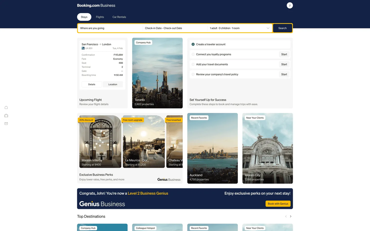
Here the goal wasn’t a separate product. It was Booking.com with business needs built in: policies, team trips and busy travelers, without losing what people already know and trust.
We designed a home that adapts to each traveler’s trips and kept the familiar flow from listing to checkout. The AI helps quietly, because the interface was already full of information.
Trustworthy: onboarding that shows the value
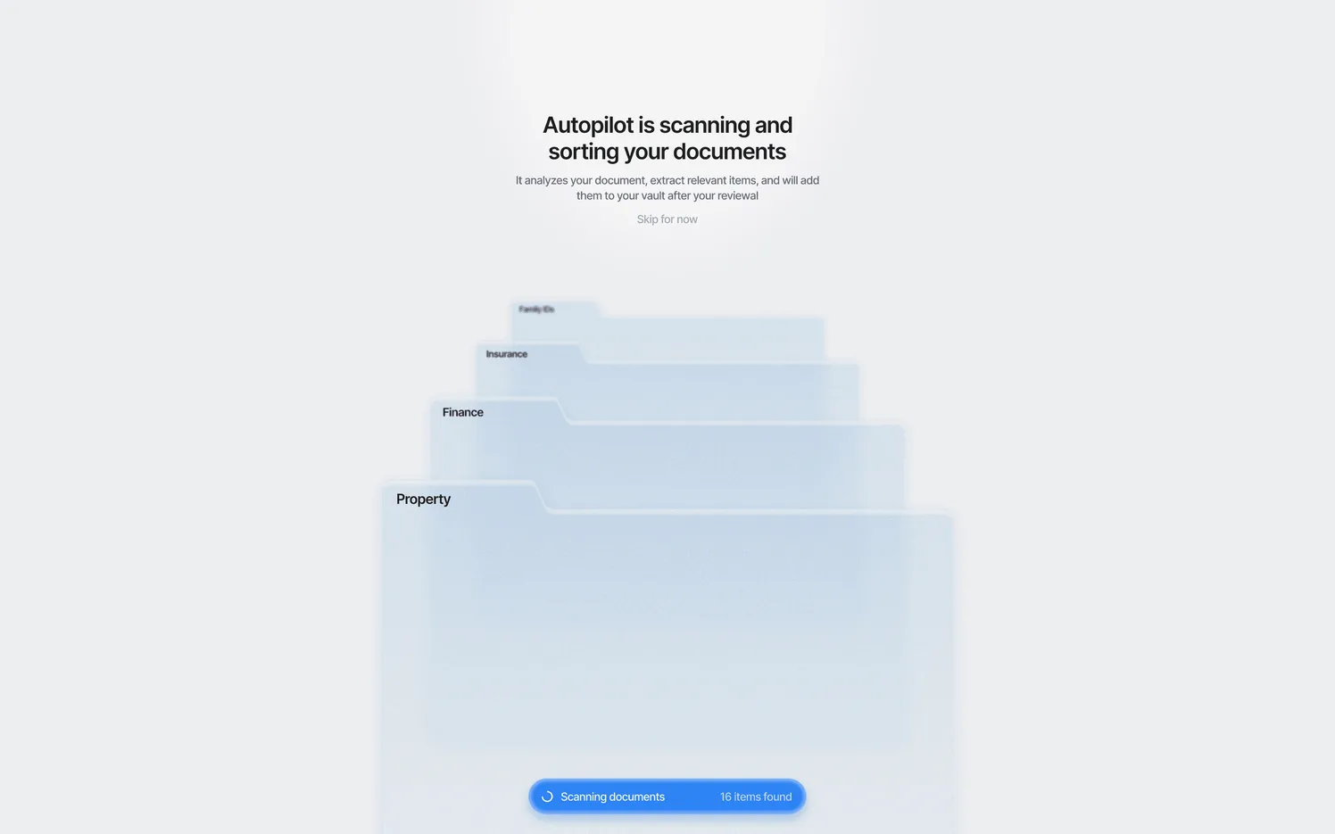
Trustworthy keeps a family’s most important documents safe. New users stalled before the first upload, so they never saw the product sort their files, and few reached the moment to upgrade.
We redesigned onboarding around one clear first upload, with AI sorting that users can watch happen, and upgrades offered once people have seen the value.
What they have in common
These are very different products, but the work followed the same path. Each started with an audit to find the flow that cost the most, and redesigned the core flows instead of every screen at once.
Each was then tested on a coded prototype before engineers built it, and left behind a design system so that the next screens would match.
An audit first
To find the flow that cost the most.
Core flows
Redesigned first, not every screen at once.
A coded prototype
Tested before engineers built it.
A design system
So the next screens match.
What to take from these
If your product is complex, the lesson isn’t a visual style. It’s the order of the work: find the one place people get stuck, fix that, test it, and leave behind a system that keeps the next screens consistent.
A serious case study should also say what it can and can’t claim, because a company’s growth has many causes.
How to read a redesign case study
Most case studies show beautiful screens and very little else. When you read one, look for three things: the problem in plain words, what actually changed, and what the studio can honestly claim.
Be careful with big numbers. A redesign is only one reason a company grows, so a figure on a case study may tell you the size of the business, not the effect of the work.
The most useful question to ask a studio is what they’d do differently now. A team that has really done the work will have an answer, and it will tell you more than the finished screens.
A weak case study
- Screens with no context
- Big numbers with no source
- No mention of constraints
A strong case study
- The problem in plain words
- What changed, and why
- Honest about what it can claim
Sources